

اقدم لكم زوارنا الكرام موضوعا جديد لطريقة تغير شكل التسميات الي عدة اشكال جديدة بهذة الاداة سوف تغير اداة التسميات الي شكل جذاب وبذالك سوف يجعل مظهر المدونة رائعة وتجذب الزوار الي مدونتك.

الان مع شرح لكيفية اضافة الاداة
اولا اذهب الي التخطيط وتضيف اداة التسميات ونجعلها سحابه
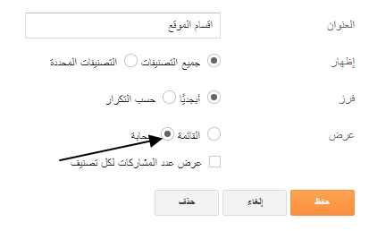
اولا اذهب الي التخطيط وتضيف اداة التسميات ونجعلها سحابه
ثانيا
الشكل الاول

كل ما هو عليك فقط ان تذهب الي لوحة تحكم المدونة / القالب / تحرير html
وبعد ذالك نبحث عن </b:skin>
ونضع فوقها هذا الكود ونضغط علي حفظ النموذج
_____________________________________________
.label-size{
margin:0;
padding:0;
position:relative;
}
.label-size a{
float:left;
height:24px;
line-height:24px;
position:relative;
font-size:12px;
margin-bottom: 9px;
margin-left:20px;
padding:0 10px 0 12px;
background:#0089e0;
color:#fff;
text-decoration:none;
-moz-border-radius-bottomright:4px;
-webkit-border-bottom-right-radius:4px;
border-bottom-right-radius:4px;
-moz-border-radius-topright:4px;
-webkit-border-top-right-radius:4px;
border-top-right-radius:4px;
}
.label-size a:before{
content:"";
float:left;
position:absolute;
top:0;
left:-12px;
width:0;
height:0;
border-color:transparent #0089e0 transparent transparent;
border-style:solid;
border-width:12px 12px 12px 0;
}
.label-size a:after{
content:"";
position:absolute;
top:10px;
left:0;
float:left;
width:4px;
height:4px;
-moz-border-radius:2px;
-webkit-border-radius:2px;
border-radius:2px;
background:#fff;
-moz-box-shadow:-1px -1px 2px #004977;
-webkit-box-shadow:-1px -1px 2px #004977;
box-shadow:-1px -1px 2px #004977;
}
.label-size a:hover{background:#555;}
.label-size a:hover:before{border-color:transparent #555
transparent transparent;}
_____________________________________________
الشكل التاني

اذهب الي لوحة تحكم المدونة / القالب / تحرير html
وبعد ذالك نبحث عن </b:skin>
ونضع فوقها هذا الكود ونضغط علي حفظ النموذج
_____________________________________________
.Label a{
padding-left:20px;
background:#000;
padding:0 20px;
color:#fff!important;
border-radius:100px;
-moz-border-radius:100px;
height:32px;
line-height:32px;
text-transform:uppercase;
text-decoration:none;
border:none !important;
-webkit-transition:all .3s ease-in-out !important;t: 30pxt: 30px;
float:left;
margin-left:5px;
margin-top:5px;
font-size:14px; }
.Label a:hover{
color:#000 !important;
background:#ff0; }
_____________________________________________


0 تعليقات
(ما يلفظ من قول إلا لديه رقيب عتيد)